top of page


WITTY BRO
IDENTITY DESIGN
PACKAGING DESIGN
Witty Bro is Hefeweizen style German beer. The brief was to design an identity for the brand which connects to the young consumer and also hints at its international origin.
The brand also inherits the word "Bro" from its parent brand which adds to the character and emotion to the brand.


#FFDD00
#FFCB05
#1996A9
#008B97
#FFFFFF
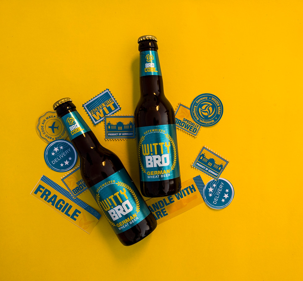

The idea of the brand is to be young and vibrant. The logo unit has wheat wreath around the type, which pictographically suggests wheat beer and also acts as a pun on the oak wreath which is usually used to certify something or to show some authenticity. The typeface with an inverted I which adds a fun element to the whole unit.
The color palette gives a fresh and bright feeling to the entire brand.


Consumer
Engagement


Project done while working at: Indospirit Group
Date: October 2017

You are here!


Kali through papercuts
Mastercard
BroCode

Brolight
Kathputli
Witty bro

GCD Studio

Glen Eden

Tom&Mew

BroSeltzer
bottom of page