


E
N
S
Ō

BRAND IDENTITY PACKAGING DESIGN
DIGITAL DESIGN
SOCIAL MEDIA
Brief
The brief was to create a Japanese whisky brand for the Indian market. The brand should be true to its roots and should resonate with Japan to the consumer.

The concept is inspired by the seven zen principals of Japanese aesthetic
Ensō. The circle. The symbol of absolute enlightenment. In its aesthetic essence, Ensō is natural, authentic, asymmetrical, rough, simple and minimal.


Kuro
Shiro
Aka

Typeface


Distilled and matured in Kōshū mountain distillery, using the pristine waters of Akaishi Mountain, Ensō is delicate and balanced blend which showcases gentle peat aroma, sweet notes of white oak and a subtle hint of caramel, followed by light spice throughout your palate

SPIRITZ ACHIEVERS AWARDS 2019
Packaging of the year &
Product Debut of the year

Web
Design
Concept
Inspired by the seven Japanese aesthetic principals. Each section talks about the principal, in relation to the product. The website is written in "Haikus'' a form of Japanese short poems


Social Media
Social media also follows the same aesthetic values as the website.


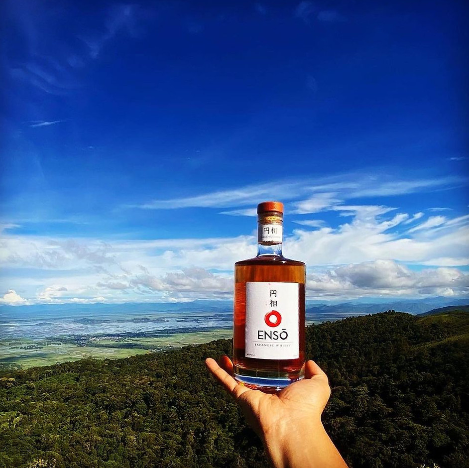
On-Primise pictures


Consumer
Engagement


The project has been done while working at Indospirit Group
Timeline: 2019-2022
Team:
Concept & Branding: Akhila Shyamala & Shubham Minocha
Packaging design, Brand language, Web Design & Social Media: Akhila Shyamala
Photography & Editing: Pratik Raj, Anirban Sen Gupta & Akhila Shyamala
Please note: All work featured on this site is primarily my own, with credits given where they’re due.

You are here!


Kali through papercuts
Mastercard
BroCode

Brolight
Kathputli
Witty bro

GCD Studio

Glen Eden

Tom&Mew
